Web Standards
@webstandards_dev@mastodon.social
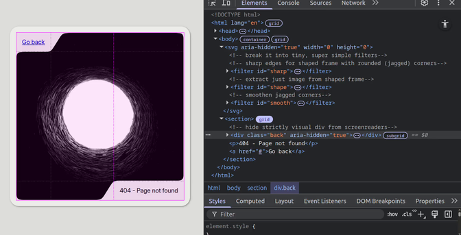
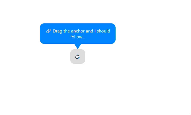
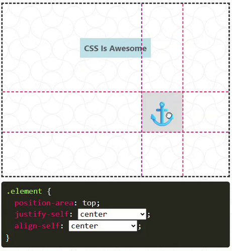
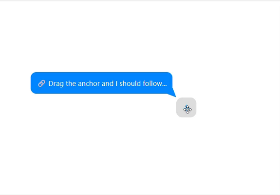
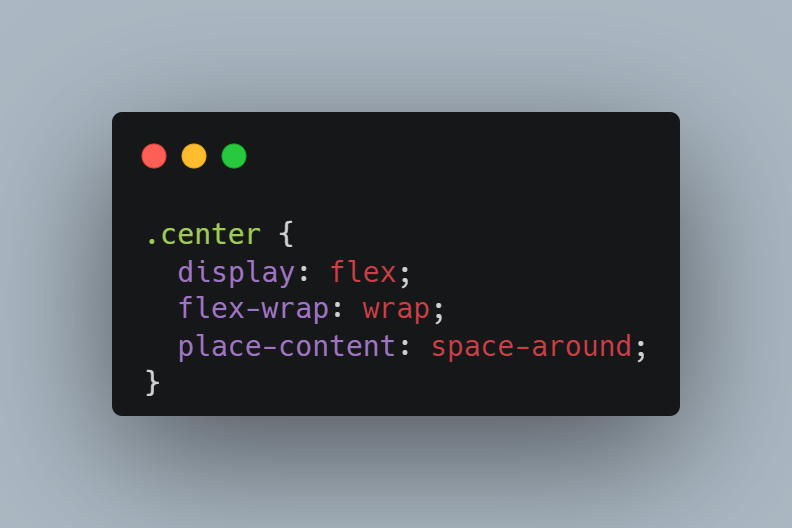
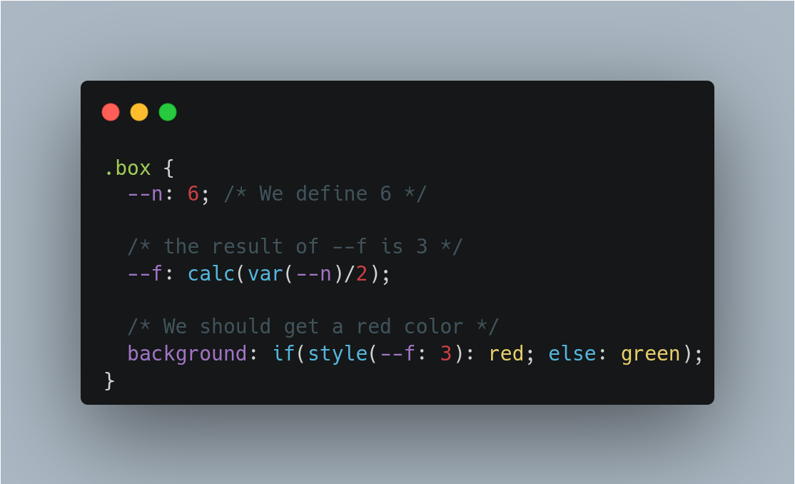
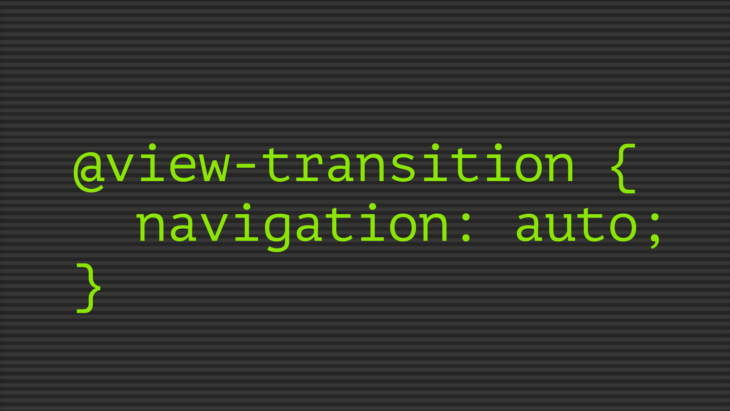
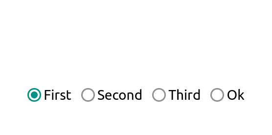
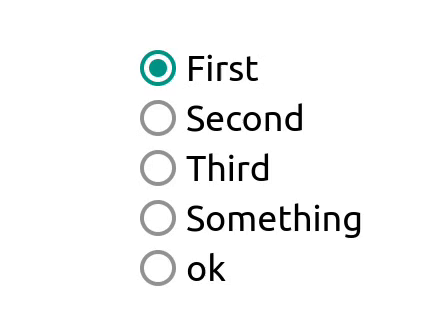
Getting a close button to hang off of a dialog. @darin explores how modern CSS Anchor Positioning can simplify the design of modals with overhanging close buttons. The technique avoids overflow hacks, wrapper divs, and ARIA pitfalls by anchoring the button directly to the dialog, keeping it accessible and visually clean. A minor scrollbar overlap issue can be fixed with a transparent border. #css #dialog


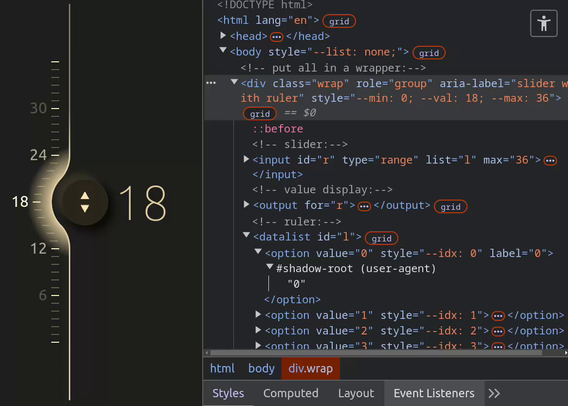
 デスクトップでは


 のデフォルトの Web UI も大分デザインがこなれてきたし、


 インブラウザデザインの夜明けぜよ


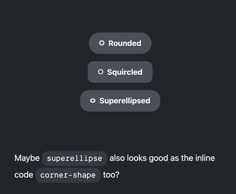
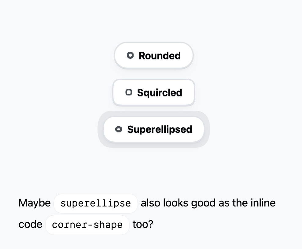
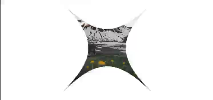
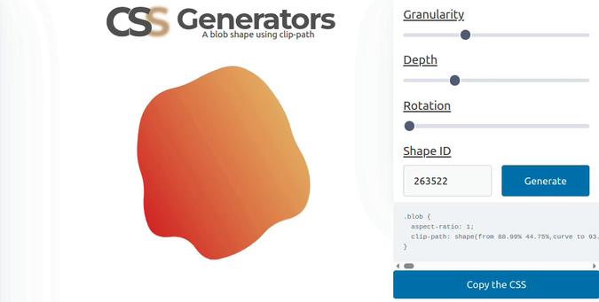
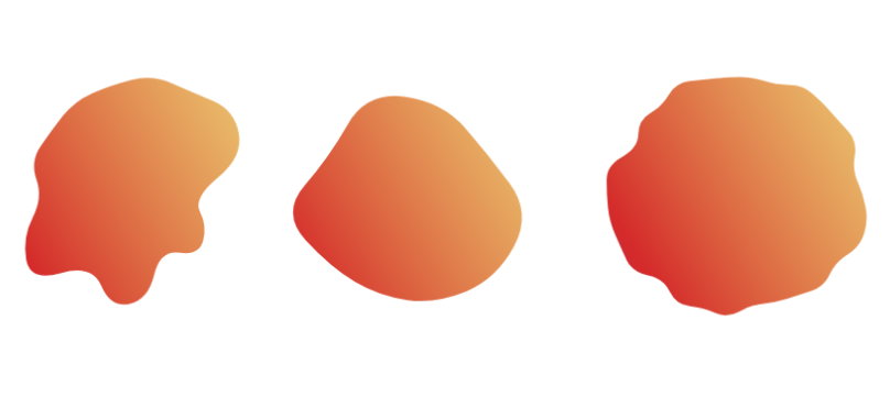
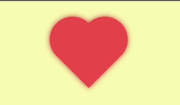
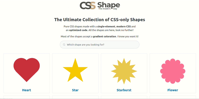
 making websites look pretty with
  btw, trying very hard not to break it while tinkering with it.
